Contact Us
![]() +44 (0)28 9002 2361
+44 (0)28 9002 2361
![]() www.twitter.com/wearesolid
www.twitter.com/wearesolid
Carol explores the world of In-Page Analytics and how it can help us measure the success of our website’s design.
Friday, February 25th, 2011This is a follow up to Andrew’s post on The Big Yellow Button. I’d recommend giving that a read first as a foundation to this post.
Your website is an important form of communication for prospective and exisiting clients. It shows your reliability as a brand, your company values and ethics and it is also a powerful sales tool. It needs to be more than just beautifully designed, it needs to be functional, easy to navigate and fulfil it’s purpose. But how do you know if it’s fulfilling it’s purpose? Enter the wonder that is Google Analytics.
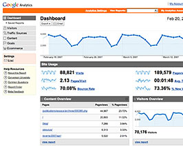
Use Analytics to track your website's success.
Google Analytics is brilliant for designers and marketers in a lot of ways, and I would recommend just setting up an account and having a good hoke around in there. Spend time familiarising yourself with the system and don’t be overwhelmed by the amount of information that is available. For now, lets look at one of my favourite features - In-Page Analytics.
In short In-Page Analytics will show you how visitors use your website and will let you know what is and isn’t working. It is a report available from the Content section of your Google Analytics reports (Content > Content Overview > In-Page Analytics). This pulls up your website giving you an overlay of what percentage of people click on what links.
Beginning with your site’s homepage, you can see which links users clicked. As you move through your site you can trace your visitors, where they go and what they want to see. This is great for answering questions such as:
This is an amazingly insightful tool into your target market and their behaviour on your site. Almost always there will be some unexpected surprises. You may find 40% of your visitors are clicking on a link you thought was relatively unimportant. Or the beautifully designed menu across the top of your site is never…ever…used. *Gasp* Or the ‘sign up now’ button that takes centre stage is avoided like the plague.
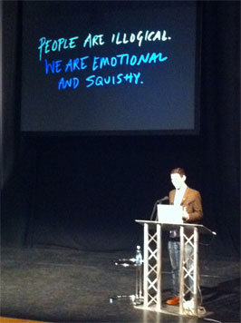
Frank Chimero at Build 2010
People by nature are illogical. Frank Chimero discussed this theory at Build Conference 2010, describing us as “Emotional and Squishy”.
I for one drink milk out of the jug and put waffles in the toaster, despite neither of these things being designed to be used in this way. But I tend to be more emotional than I am rational, and it’s this tendency to be led by emotion which results in us making illogical decisions.
People like me are a designers nightmare. Your nicely formatted plans for where visitors should go on your site and how they should get there are often tossed aside like an old hat, and the user will progress with total emotional abandon.
“If users abandon the menu bar, then focus your creative energy on improving your in-page links.”
In-Page Analytics will show you how the unconventional visitor navigates your site by tracing their progression. This helps you to focus your energy on how to direct these kind of visitors to your site’s hot spots. If they abandon the menu bar, then focus your creative energy on improving your in-page links. If your homepage is busy but only 4 links are ever getting major attention, then kick out the clutter. This will improve user satisfaction, and help drive traffic to where you want them to go.
Assessing your In-Page Analytics can majorly boost your website end goal, whether that is increased sales, getting people signed up to a mailing list, or making sure users get the appropriate information. Take the patience to really get to know your visitors and how they interact with your site. You’ll be surprised at how the smallest changes can have the biggest impact on it’s success.
Tried it? Let us know how you got on by tweeting us @wearesolid.
Carol heads up marketing here at SOLID, and has a particular flair for increasing brand presence online through Google, Twitter and Facebook.
We use twitter as a public forum for discussions. If you'd like to comment on this article, you should follow @wearesolid and send us a tweet!
Postal Address: SOLID Web Design Belfast, 17 Coopers Mill Avenue, Dundonald, Belfast BT16 1WR
Tel: +44 (0)28 9002 2361 Email: info@wearesolid.com
All content and imagery including design and code copyright © SOLID 2013. No work can be reproduced without prior consent.
SOLID Web Design Belfast - Corporate Branding and Website Designers Northern Ireland